This post is a reedition. recruitivity is no longer being maintained, even though it’s still available on the chrome store and working.
From ugly af to pretty decent (not talking about my journey from 10th grade to current days 🌝).
I'm talking about our design revamping journey.
Pull the thread you might learn 1 or 2 things.
We needed a new design
Technical stack migration
It was part of a bigger project: the migration of our tech stack. The point was to:
Lay the foundations of future iterations
Remove bugs
Come up with smthg decent (despite being intentionally bland).
We don't know who the Ideal Customer Profile is yet, so there’s no point investing too much in the brand yet.
Uglier than before
The migration began. We used storybook to set up a design system and gave 0 fucks about design for a long time.
But once we realised that the extension had become uglier, we had no other option than to tailwind the hell out of it.

Let's just try not to disappoint users.
The revamping began
Getting up to speed on Figma
I knew Figma was powerful but I only knew 3% of their features at the time. I knew that if I wanted to be serious about design, I needed to level up.
So, I followed this Figma wireframing crash course on Youtube. Pretty good.
Reality check
It feels like a design always starts with a colour palette. So I tried to tweak the original one, inspired by Morpho Labs (you’ll understand why later).
But I'm no good tweaker 🤡
After dabbling for a while, I realised I just couldn't rebalance the ferkakta palette. More so, I realised I was not doing the design any justice by trying to be creative.
So I resorted to copycatting.
Copycatting
Sixtine Mailleux happens to be a wonderful designer and a great friend of mine with a public portfolio. Inside her gorgeous portfolio lied the design system of @MorphoLabs 🌝
plagiarism mode activated

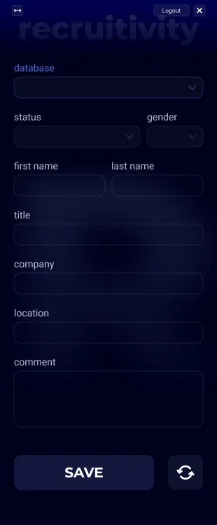
I came up with this.
Though I was happy with the outlet, 2 things came out of it:
Know when to stop
I shared Sixtine's insights with Gauvain so he could build upon what I’d started. He:
Cut all my baroque crap
Switched to a lighter theme
Built something significantly better looking than I did.

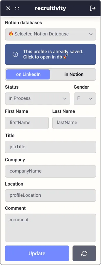
This is what the extension looks like today.
All-inclusive
Let's be honest: it's bland and all-inclusive—but to perfection.
Obviously, we'll get back at it as soon as we get a better sense of our ideal customer profile.
Building a strong brand is something I've been fancying a lot lately because I believe it's a powerful growth lever.
A design crash-course: 8 tips
Let's wrap up with designing guidelines from Sixtine.
Quit designing, she said (she did not lol)
8px is a standard: use multiples of 8 everywhere (sizes, gutters, paddings, ...)
For chrome extensions, a 4-column-16px grid with 8px gutters is a sure path.
Don't re-invent the wheel → take a screenshot of something you like, opacity to 30%, and layer your own Figma components on top.
Leverage Figma's community to find suitable UI Kits (e.g Source Starter Kit 3.0)
If you choose a UI Kit, go all-in on it (for consistency).
Use Figma's component feature to build design systems. One change in the design system is automatically reflected everywhere.
And for Chrome Extensions specifically → layer wireframes on top of screenshots (e.g a LinkedIn profile page) to match the size of your components with that of the destination page.
